3D Resin Printing 00 Model Trains #16
A simple hopper design that doesn't look right.
Scaling a Model
I actually completed this months ago but haven’t had time to write it up. Now I do.
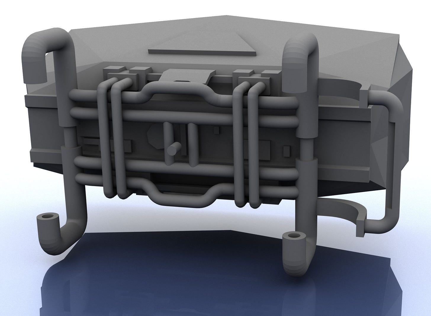
For a first design I figured a simple hopper would be a good idea. Not much to mess up. Although I managed to. Here’s the design…
The sides are angled outwards, coming to a point at the lower middle. Which means it needs to be higher than normal to hold the same amount of material. Or not. This isn’t going to be scaled to full size and used in reality!
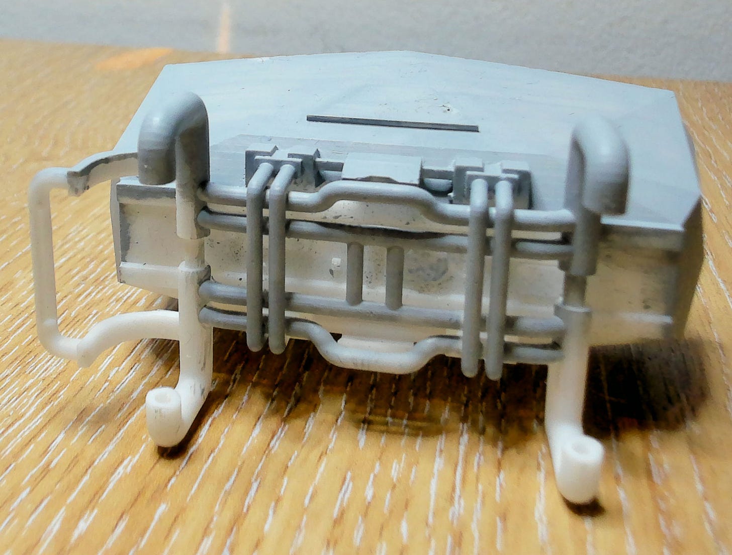
A little detailing was added to the underside. Mostly to check if the printer could handle it. I was expecting some failures to the underside once printed.
It looked fine in Maya. Even better with wheels attached. It’s not anything groundbreaking, but it’s better to start simple and work your way up. Rather than having failures on a complex print then having to work your way back.
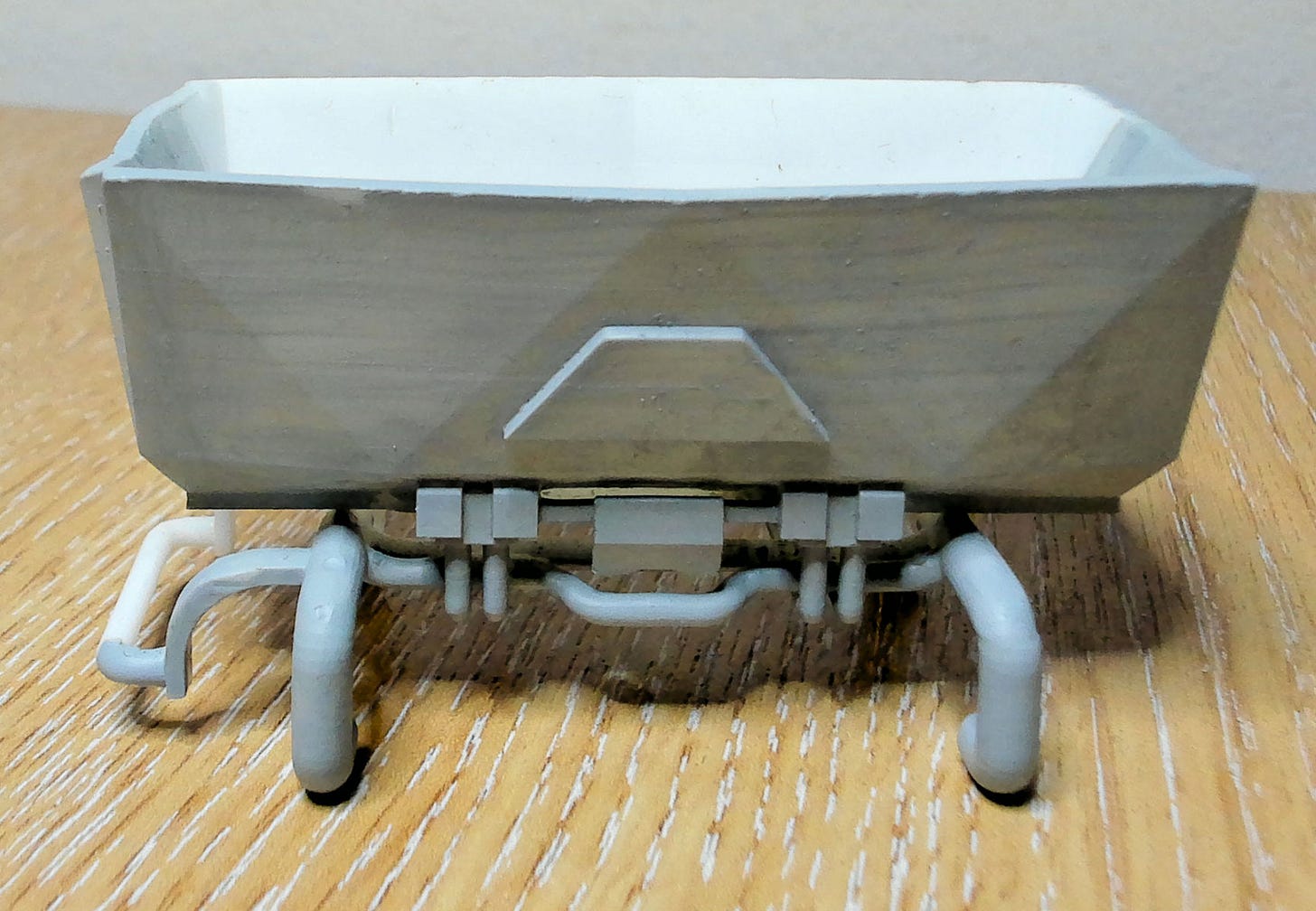
It Printed Alright
There was a tad more horizontal banding than expected. It doesn’t show up in the pictures too well and you have to be holding it pretty close to your face to notice. But it’s there and bothersome. Bothers me.
It’s a mixture of printer resolution, printer settings, print rotation and some lower poly areas which can be smoothed out. Nothing that can’t be easily fixed within a few minutes (and a new printer, I’m still on 2k).
As for the underside? Printed flawlessly.
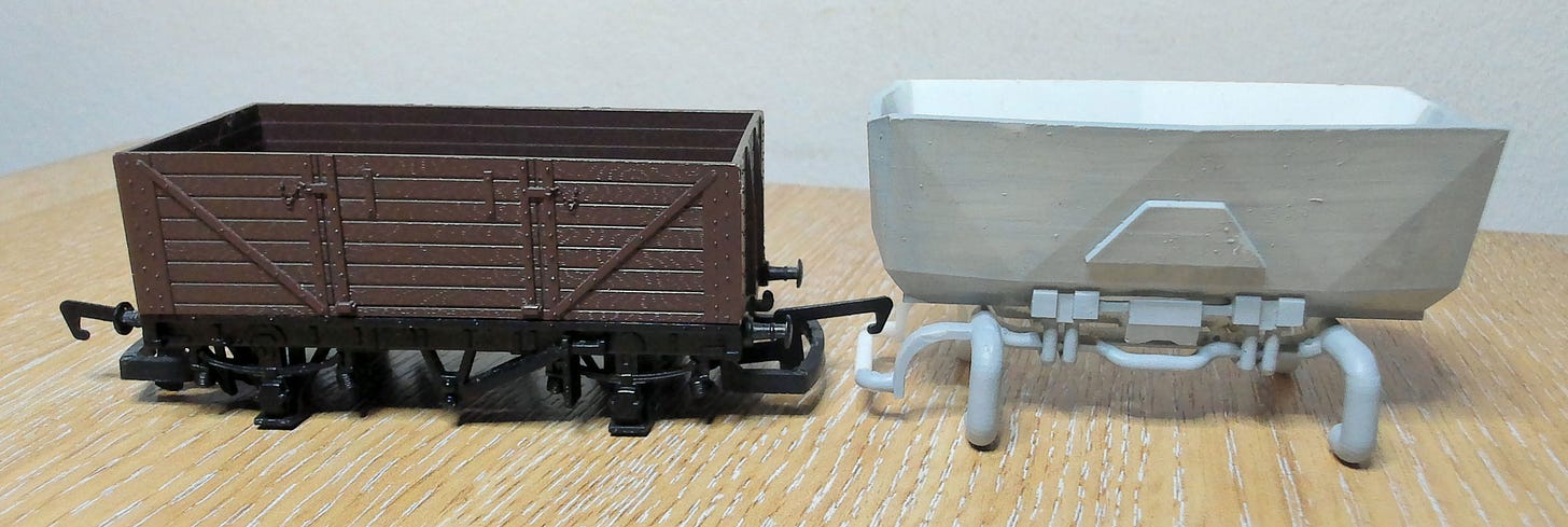
My metal wheels fit, printed wheels fit and hook system aligns with retail models. All good. Except, how the hell do I paint it?
Never thought about painting. I can’t paint. So the model was made as I wanted to see it, not from a practical point of view. I didn’t realise this painting issue until a few models later. Once this was printed, it was put to the side and I moved on. So the next post will also mention painting issues. But I do fix them in that model and every other model going forwards (hopefully).
The fix, in case anyone hasn’t guessed, is to split the lower chassis from the container area on top. While I fixed this on other models, I never did for this one for a couple of reasons.
It’s very hard to do with the way it’s currently joined. Guide holes are needed for things to slide together and there’s very little space for them. It doesn’t absolutely need guides, but then you’re reliant on the end user gluing it together blindly. That doesn’t sit well with me.
I also don’t like the design. The scaling is wrong; it’s too high, too thin and needs more thought put in to smaller details so it makes impact. There’s no point fixing it if I’m going to start again. Especially as this was months ago and there are better uses for my time machine.
Other than that, I’m happy. Got a a print rolling along some track and flawlessly hooking on to retail designs.
I have noticed that buffers on my retail products never quite align correctly to each other. Not a problem as buffers aren’t used as buffers on these models, the hook bars act as buffers. I made a note to myself that going forward I don’t need to worry about buffer placement too much as they’re purely aesthetic. So long as they exist and are reasonably close, that’s good enough.
Making progress.
Going Forward
I have a few more hopper designs lined up, but I have a certain hopper design which may be more interesting.


