They’re Not Great
In a quest to draw something realistic, but more unique than off the shelf products, I was thinking… circus? Cages seemed easy so I started with them.
I may have made the models too basic, however the idea with circus vehicles is details come from the final painting. They need to be bright and vibrant in colour, not overly complex 3D prints.
There are minimal, if any, real world photos of circus trains on the Internet. Most of my reference images came from early 20th century photographs of road vehicles. Basically the same thing.
What I don’t like about these models is the vertical sides. They’re mostly flat instead of being stacked horizontal wood beams. Almost every reference image I found had flat sides so that’s what I made. My thinking is they’re flat to make them easier to paint. If the board joins were visible, they would interrupt the flow of the art.
Therefor my models may look basic, but that’s because they’re only half finished without the art painted on. I’m also not thrilled with a lot of the axle hubs. I’m not very creative and it’s the best I could do without reference images to copy from.
All these designs come in 2 parts; chassis and cage. The cages lift vertically off their chassis’, with a locking mechanism to hold them in place. That way animals and bedding inside can be changed any time.
I did have working door designs, though quickly abandoned them after my first failed prototype print. My 2k printer struggles too much with the detailing required for hinges and they’re very flimsy because they’re so small.
The door idea was so that things could be placed inside without a 2 part design. The detachable cages make far more sense to me now. It means the interiors aren’t limited by the size of the door. Although they should be for realism.
Imagine them painted in bright colours with lots of crazy designs and... they’re probably still shit.
Model #01 - Basic First Attempt
Apart from the swirly wheel hubs, it’s nothing special.
Model #02 - For Smaller, Dangerous Animals?
The doors on this one are shorter and wider. Doors for animals like tigers?
Not sure what to call those axle hubs. Exploded stars? The problem with them is they’re load bearing, even on a model, which required strengthening so the finer parts don’t snap when fitting axles.
Model #03 - Something More Organic
Added a lot more swirly objects. This limits the print design and creativity. Although it makes the overall design more prominent due to depth.
Hate the axle hubs but wanted more designs. I’m struggling to imagine if they would look good painted. They don’t follow the flow of the rest of the model. Are they too mechanical? Perhaps I should have made them organic flowing designs?
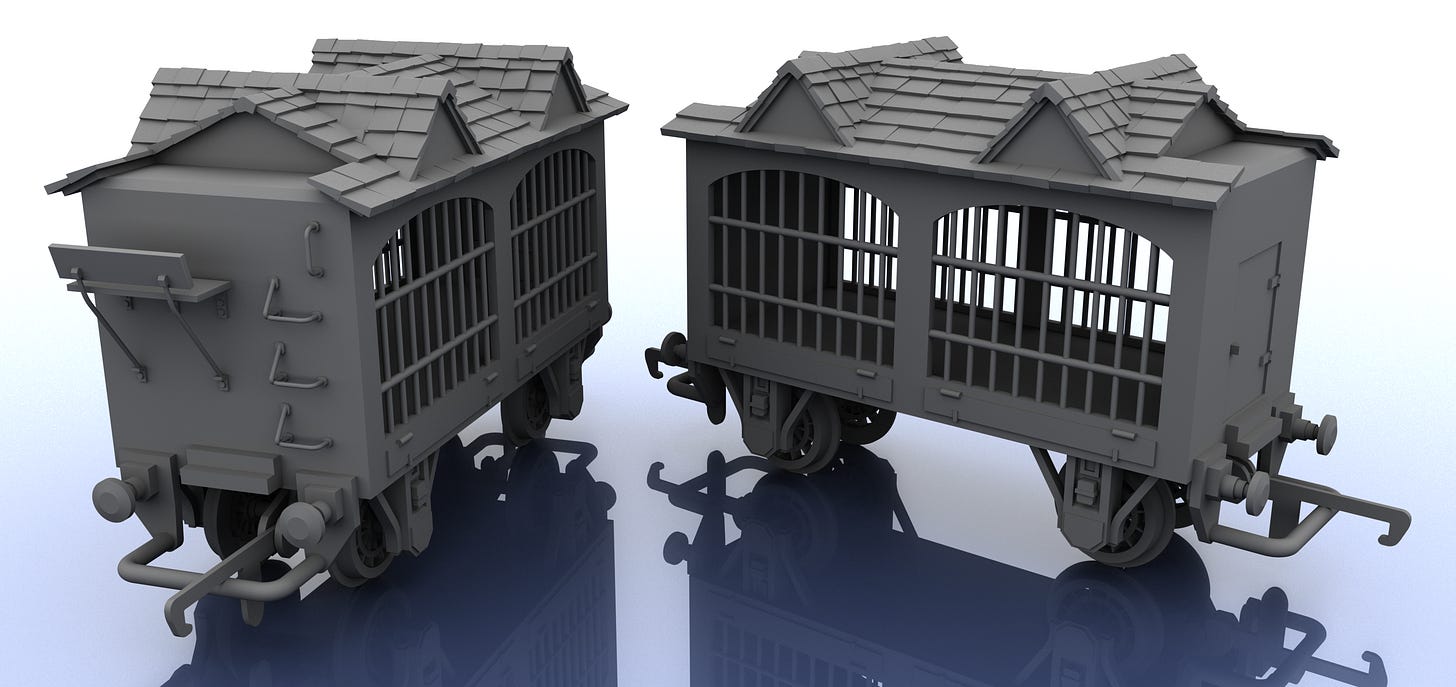
Model #04 - It’s Not a House!
I love the roof on this one. Took me a couple of hours to make and was worried it would look terrible. Figured if it didn’t look good here, I could save it to my folder of garbage and maybe use it for a house in the future?
This is the only design which might look better with horizontal slats for the vertical walls. Could work as it is with bright red walls and darker roof tiles? I’m terrible with colours.
Going Forward
Maybe a caboose?


